PRISM
Program Management Practices
- Best Practices
- Featured Program Metrics
- Additional Program Metrics
- Organization of Activity
- Activities’ Transition Time
- Staff Positively Guide Behavior
- Youth Relations with Adults
- Youth Relations with Peers
- Space Adequacy
- Overall Socio-Emotional Environment
- Informal Time: General Staff Performance
- Informal Time: Youth Engagement and Behavior
- Youth Feel Challenged
- Supportive Adults Present
- Helps Youth Academically
- Helps Youth Socially
- Social-Emotional Skills
- Measurement
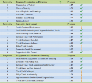
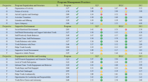
This section of the PRISM contains data about program practices obtained from a third-party observation and a common youth survey. The practices are divided into three sections: program organization and structure, supportive environment, and engagement in activities and learning. The perspective column on the left indicates whether the data is from the observer (“O”) or youth (“Y”) perspective.
The first data to appear is the program’s own score. This number is followed by either a green checkmark to indicate they met the benchmark of desired frequency of practice (i.e., programs demonstrated practices that promote youth engagement and stimulate thinking “most of the time”), or a yellow exclamation point to indicate they did not meet the benchmark.
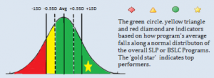
Following this are comparisons to the program’s cohort of peers (AQP for school year programs, SLP and BSLC for summer programs). The score for the cohort is the average of all programs in the cohort. The cohort score is followed by a symbol that indicates how the program’s score compared to the overall score of the cohort. The symbol is coded to show how many standard deviations the program’s score is from the cohort average. Programs should refer to the legend at the bottom of the PRISM, and additional guidance on how to interpret this symbol is provided here.
- A green circle means the program is performing within a -0.5sd to +1.0sd range around the cohort average. In other words, the program is on par with its group of peer programs.
- A yellow triangle means the program is performing within a -0.5sd to -1.0sd range below the cohort average. This symbol indicates the program is slightly underperforming compared to its group of peers.
- A red diamond means the program is performing at greater than -1.0sd below the cohort average, and is doing less well than its cohort of peers.
- A gold star means the program is performing at greater than +1.0sd above the cohort average, and is outperforming its cohort of peers.

- Look at your ratings compared to the benchmark first. In what areas did you meet the benchmark? Where did you fall short? Do the results align with what you might expect given your program’s goals, content, and structure? What surprises you? What questions do the results cause you to ask?
- Refer back to your APT Observation Summary write up that you received shortly after the observation date. What insights do you gain by looking at the qualitative notes next to the ratings? What additional questions does this raise for you? How do these two sources of information align with what you know about your program from your own experience?
- Refer back to your attendance data. Are there connections to be made between any of the program practice results and your average rate of attendance?
- Compare your time points. If you are a school year program, what change in practice happened from fall to spring? If you are a returning summer program, what change in practice happened from last year? What contextual factors about your program planning, staffing, training, content, activities, curriculum, location, population served, etc., might shed light on these changes?
- Compare observer and youth ratings. Where is there agreement in rating across similar areas of practice? Where is there disagreement? What might the two perspectives be noticing about your program?
- Compare your benchmark rating against the cohort comparison symbol to see whether or not areas of strength or struggle for your program are also areas of strength or struggle for your peers. Here are some example combinations and what you might infer from them.
- An exclamation point and a green circle = you are not meeting the benchmark, but are still performing similarly to your peers, which means this is an area of relative challenge for the entire cohort.
- An exclamation point and a red diamond = you are not meeting the benchmark and you are underperforming compared to your peers, which indicates there could be best practices in this area to learn from your peers or from the Insight Center.
- A checkmark and a green circle = you are meeting the benchmark and performing similarly to your peers, which indicates this is an area of relative strength for the cohort
- A checkmark and a gold star = you are meeting the benchmark and outperforming your peers, which indicates you might have some best practices to share with your peers.
- An exclamation point and a gold star = you are not meeting the benchmark but are still outperforming your peers, so although this is a struggle for the entire cohort, you may have greater insight into best practices to share with your peers.
- Have another staff member at your program go through this exercise separately from you and then discuss your results together. What are different types of staff inferring from the results and what does that reveal about your program?
- What are one or two areas of strength that you want to focus on maintaining, and what needs to happen to ensure those strengths are fully integrated into every aspect of your program, from planning to hiring to recruitment to training to program delivery?
- What are one or two areas of challenge that you want to focus on improving, and what needs to happen to ensure those challenges are adequately addressed across every aspect of your program, from planning to hiring to recruitment to training to program delivery?


